
Google Summer of Code 2020
Time Series Updates for
Traveler
Mentor - Kate Isaacs
In this Google summer
project, my goal is to make the Traveler interface more illustrative,
interactive, and responsive by reducing visual lagging, adding new linked
visualizations, and enhancing existing visualizations and interactivity. Older
SVG views have been converted to HTML5 Canvas to make a responsive user
interface with enhanced interactivity. A new chart containing a histogram of
primitive duration has been created to filter out intervals of a specific
duration. This supplements the user experience in
discovery of intervals having too long or too short duration. Interpretability
of the Gantt chart has been augmented by the addition of traceback lines (from
a child interval to its parent) and color highlighting which eventually helps
to track down dependent and relevant intervals. The hardware performance
counter values have been made more explicit by representing aggregated
(minimum, maximum, average) values. The Traveler interface is now equipped with
more options for explorative performance analysis, better feature detection,
easier artifact isolation, and faster debugging.
First Phase:
In the aim of providing
faster data browsing experience, I followed a three phased approach to
eliminate the visual latency. In the first phase, I created several API calls (drawValues, newMetricData, ganttChartValues)
to present the data for the frontend UI. The APIs are created as a wrapper over
a previously designed library utilizing summed area table data structure.
Second, data fetching mechanisms are implemented through those APIs using
asynchronous calls and stored in a unified cache object. Third, in the frontend
interface, the older implementation with SVG is totally overhauled with a newer
implementation using HTML5 Canvas.
The following charts have been created using HTML5
Canvas:

Figure: Gantt View

Figure: Utilization
View

Figure: PAPI Metric
(Total CPU Cycle)

Figure: PROC Metric
(Available Memory)
Second Phase:
In the
beginning of this period, I completed writing code to handle synchronous
function calls which generated consecutive same events in the same hardware
locality. This problem is handled by storing a stack of previous events and
inserting new logical leave event in the place of consecutive enter events and
vice-versa. This enables Traveler to
read, parse, and visualize OTF2 logs with synchronous function calls. I also
fixed a legacy bug in our system, which is, previously, we considered that the
PAPI metric values would be same for the events of a single interval. More
specifically, we stored metric values in a single JSON object for an interval.
But the metric values could be different for an interval’s enter and leave
event. To resolve this issue, I used two separate JSON objects to store the
metric values related to a single interval. This also helped to handle and
manipulate the metric data more precisely since previously it was just losing
metric events for leave events. On the frontend of the line charts, I have
added dots to help users identify each value more precisely.

Figure:
PAPI Metric (Total CPU Cycle)
To filter
out different intervals, I have designed a new chart to contain a histogram of primitive durations. The new Histogram view presents the
count of intervals of a specific duration on a logarithmic scale. This new view
is acting as an accessory to filter out and highlight data in the Gantt View.
In the backend, I have reused the summed area table data structured to store
and process relevant information for the interval-durations per primitive. In
the frontend, the user interface has been designed using HTML5 canvas. A brush
has been provided to let users navigate on different time spans. Users could
easily find out the time duration which is
taking higher to complete for a particular primitive.
Upon selection with the brush over the Histogram, intervals with related
primitive is being highlighted with the same color in the Gantt View.
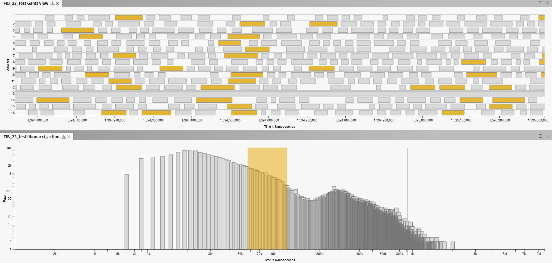
Figure: Primitive
Histogram View
I have also added a hamburger menu on the left sidebar to browser and
select a primitive from a list. Upon selection of a primitive, respective
Histogram view will appear on the interface.

Figure: Hamburger menu
containing Primitive names
Final Phase:
At the beginning of this phase, my aim was to draw a
series of lines between an interval with its parent interval, and so on, which
will eventually help users to follow through a traceback line of dependent
interval bars in the Gantt chart. I tried to find out timestamps for a series
of dependent intervals. I ended up modifying a legacy implementation to fetch
the data only with timestamp and thread locality information.
After figuring out how
to supply the data from the backend through a new API, the next challenge was
to draw the lines with a single mouse click. The single mouse click event was
bounded with highlighting intervals of the same primitive name. To highlight
interval bars with the same primitive name, new color was being drawn over the
existing canvas, while for the traceback lines, the whole canvas needed to be
cleared and redrawn which eventually was removing the highlighted intervals.
This was overcome by serializing the functions - first drawing the tracback line and then highlighting the interval bars.

Figure:
Traceback line and highlighted interval bars on single mouse click
This figure
demonstrates how the traceback line and highlighted interval bars are being
drawn on single mouse click over any interval bar. The lines and highlighting
also are being retained if the user starts panning to
the left. Only the lines are being retained on zoom in/out event. A possible
future enhancement of this feature could be to draw forward trace lines (parent
to its multiple children).
Additionally, the line
chart view for the PAPI metrics has been modified to represent minimum, maximum
and average value for each metric. Previously (implemented in the first phase),
only one thread locality’s data was being drawn in this chart. In this phase,
it has been modified to show aggregated data for all thread localities.
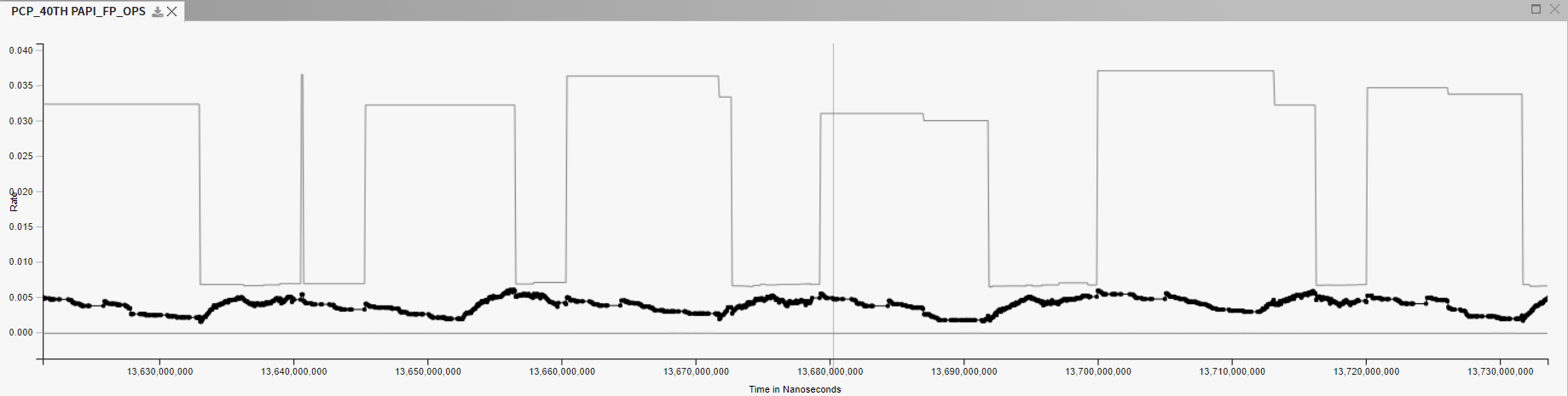
Figure: Aggregated
values for Floating Point Operation (PAPI_FP_OPS) change rate
In the figure above,
grey lines are utilized to represent minimum and maximum values. A dotted black
line is used to show the average values. To enable this feature, aggregated
values (min, max, avg) in JSON format have been provided from the backend. With
this, the UI does lose the actual value for each location. Therefore, it might
need to be modified later if actual values are required. Again, the presented
lines for minimum and maximum values are approximated values which might
misrepresent what is happening in a specific timestamp. A shaded region
(instead of straight lines) might be utilized here to reduce this confusion.
Again, in future, more aggregated values like median, standard deviation,
variance, etc. could be incorporated in this chart.
List of completed
features:
●
Newly included and modified APIs:
o drawValues
(Utilization)
o newMetricData (PAPI and
PROC metrics)
o ganttChartValues (intervals for the Gantt chart)
o getPrimitiveList (intervals of a selected primitive or GUID)
o getIntervalInfo (Fetch all metadata for an interval)
o getPrimitiveList (fetch primitive list for the hamburger menu)
o getIntervalDuration (histogram
data of each primitive duration)
o getIntervalList (filtered
data for the Gantt view)
o getIntervalTraceList (traceback
data for the Gantt view)
●
Summed area table technique implemented to fetch and organize
data in the backend with the implementation of sparseUtiliationList.py class.
●
Using HTML5 Canvas to draw the charts:
o Gantt View
o Utilization
View
o PAPI
Metrics (PAPI_TOT_INS, PAPI_BR_MSP, etc.)
o PROC
Metrics (MemAvailable, Buffers, status:VmPeak, etc.)
●
Common mouse interaction implemented across all views:
o Scrolling
to zoom (in/out)
o Panning to
slide (left/right)
●
Basic mouse interaction implemented in the Gantt View with a
separate call to the backend for the metadata. (hover, single click, double
click)
●
An intermediate cache
object utilized to store and maintain data.
●
Sliding left pane window with the dataset list added.
●
Locations ordered numerically on the Gantt View.
●
Metric values for enter-leave events of an interval stored
separately.
●
New logical event added in place of each nested function
calls.
●
Summed area table technique reused (designed in the previous
evaluation period) to fetch and organize data in the backend for the primitive
histogram.
●
New Primitive Histogram view created using HTML5 Canvas.
●
Brush functionality implemented on the Histogram view.
●
Related intervals highlighted in the Gantt View when brush
modified.
●
New locking mechanism implemented to synchronize interactive
data highlighting in the Gantt view.
●
A series of traceback lines from an interval to its parent
interval bar are being drawn in the gantt view on a
single mouse click event.
●
Both the traceback line drawing and interval bar highlighting
are being done on single mouse click event.
●
The traceback line drawing and interval bar highlighting are
being retained on mouse panning-left event. On mouse panning-right, the lines
are being drawn up to the interval bar which was being clicked initially.
●
Line chart view modified to represent aggregated (min, max,
avg) values.
List of my Pull
Requests:
−
https://github.com/hdc-arizona/traveler-integrated/pull/49
−
https://github.com/hdc-arizona/traveler-integrated/pull/52
−
https://github.com/hdc-arizona/traveler-integrated/pull/57
−
https://github.com/hdc-arizona/traveler-integrated/pull/59
−
https://github.com/hdc-arizona/traveler-integrated/pull/62
−
https://github.com/hdc-arizona/traveler-integrated/pull/67
−
https://github.com/hdc-arizona/traveler-integrated/pull/71


